
The Game Crusaders: Knightly, honourable, fighting for the best in the gaming industry. But what is a videogame website without a logo? Giving you the inside look in the design process, this post takes you through how our very own Piet Crusader created our logo.
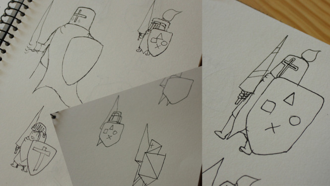
With a name like Game Crusaders, it was pretty easy to come up with related themes and keywords. Knightly and honourable came to mind and soon enough I was drawing shields, lances and banners – all symbols of honourable knights.
These first sketches all involved elements from a controller.
I tried adding in the gaming theme as a symbol to the shield, but something just felt off. This set of arms felt very official and not comicky enough. After all, we Game Crusaders love games best when they are fun, and formality is in general not associated with fun at all.
So back to the drawing board. Or Google, actually. I Googled “crusaders” to find out what they really looked like. The results were filled with knights and soldiers clad in white and red armour and cloth. Crosses were a common symbol on both chest and shield. And then I thought, what if a crusader like this would be an indie game character? With that mindset I started sketching.
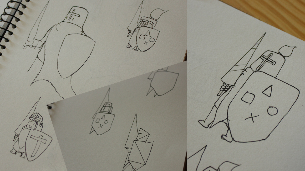
First step to designing the Game Crusaders’ logo was to do some sketching in my idea book.
After a couple of doodles, the idea of a geometric styled character appealed to me most. This was a job for Illustrator and a lot of puzzling with triangles, rectangles and other shapes followed. Half inspired by a pixelart version of Knight Solaire I found online and the Journey character, this was the first result.
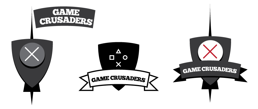
The character still featured a lance and a shield. A cross symbol on the shield felt way too heavy and religious however, so I tried to bring back a gaming theme. The x-square-triangle-circle of the iconic PlayStation controller made a reappearance, but of course we wouldn’t want to side with any particular brand or gaming device. For a while the circle was the placeholder symbol because I thought it looked somewhat like a button and I moved on to typography.
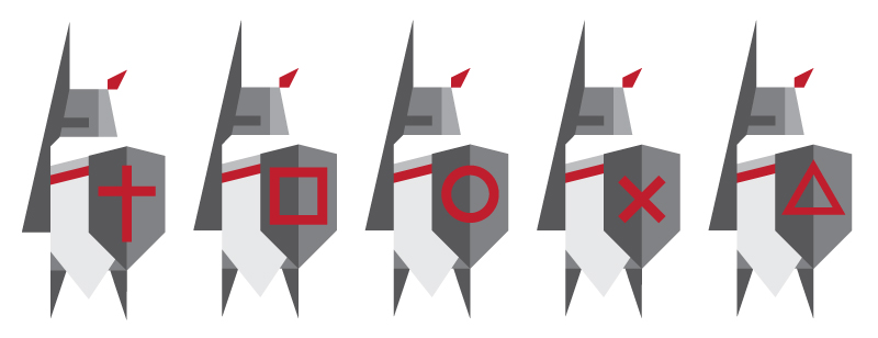
Different variations on the shields of the logo.
A classic retro font was my first guess, but it clashed with the geometric style of the character. The more modern fonts all seemed too official and formal. Eventually, I came across this bold handwritten font and it matched the vibe I was going for completely. A line underneath the title should bring the whole thing together and, as a funny coincidence, this turned into the shadow of our symbolic character. Experiments with colours followed and Erik and I decided on a final colour scheme.
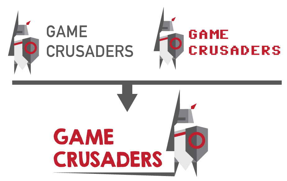
Different fonts were tried to go with the newly designed Game Crusader.
It was time to revisit the symbol on the shield. With the typography in place, the logo didn’t need the gaming symbol as much as I thought it initially would so I decided to go back to the crusader symbols I found on Google.
This time around I tried to blend the cross more into the shield, making it more like a decoration, rather than a statement. And with a bit off fiddling with shapes, colours and shading, this turned out nicely. With that final important tweak the logo was finished.
Witness it here, in all its knightly glory!
What do you think of our brand new logo? Let us know in the comments or through Twitter.
Piet Crusader
Latest posts by Piet Crusader (see all)
- My (unannounced) visit to the FromSoftware office in Japan - December 18, 2014
- The Making of the Game Crusaders Logo - December 1, 2014
- No Fair Game episode #2: Superhuman NPCs - October 17, 2014